

Information Design/ UI + UX/ Branding
Locally sourced flowers. 24/7.
Flowers & Co. is a local flower shop located in Fort Lauderdale, Fl. They offer locally sourced flowers and strive to offer customers competitive prices through price matching with competitors. Flowers & Co. customers include those who purchase floral arrangements regularly as well as those who make one off purchases for special occasions.

Date
November 2021 - December 2021
Role
UX Designer + Brand Strategist

( The Challenge )
Customers lacked the ability to order online and an easy way to access their reward points.
Goal
Design an app for Flowers & Co. that makes it easy and convenient for users to order and preview their floral arrangements.
We used the design process: empathize, define, ideate, prototype and test to meet out goal.
Research

Research
Test & Iteration
Ideate & Design


USER INTERVIEWS
Conducted user interviews via surveys distributed through UX Design Peer Spaces. A primary user group identified through the research study were working adults who purchased floral arrangements a few times a year.
The user group confirmed initial experiences of unattractive, outdated floral arrangements shopping experience. Feedback also revealed users want more detail when viewing floral arrangement previews such as flower origins, meanings and size comparisons.

PERSONAS
Target user

( USER JOURNEY MAP )
This user's journey revealed how essential it is for user's to have any easy, quick, and customizable process to order flowers.
%201.png)
.png)

Ideate
This storyboard represents the big picture and close up perspectives of users utilizing the Flowers & Co. app


Design
Design
Design
Design
Design
01
Paper Wireframes
Red stars signify the elements that best addressed the user's pain points and needs.

Home Screen

Flower Profile Screen

Customize Screen
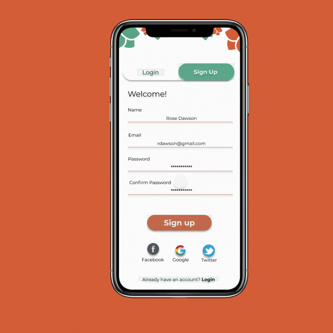
02
Digital Wireframes
The initial designs focused on the user's ability to view the floral arrangements in various ways as well as the ability to customize their orders.
The carousel on the home screen made it easy and fast for users to find seasonal and holiday flowers. A featured flower finder quiz made it easy for users to find personalized search results.

03
Usability Study: findings

04
Mockups + High Fidelity Prototype
Insights gathered from the usability studies were used to iterate and design mock ups. Upon reviewing user feedback, the arrangement of the homepage and flower profile pages were changed to make it easier for customers to find floral arrangements and order. The second usability study revealed that users were confused as to what "categories" meant. In order to make it clear that this was a feature they could use to order flowers it was changed to "find flowers".
A third usability study was conducted after the first version of the high fidelity prototype was completed. The homepage had the biggest overhaul, with the "find flowers" feature being replaced with a more simple "just for you" and "flower categories" feature. The color palette was also updated to improve the overall brand aesthetic.

.png)

05

Accessibility considerations
Test & Ideate
06
Impact
Impact
Impact
Impact

"This flower app was straightforward and easy to use." - User B, usability study participant
What I learned

It's essential to get as much feedback from users throughout the design process. The early designs allowed for testing, but the second and third usability studies improved the quality of user insight and feedback. They resulted in significant iterations to the designs to create a final product that users found easy to use.
( Next Steps )


